ottobre 01, 2013

Fast Food is not Good Food.

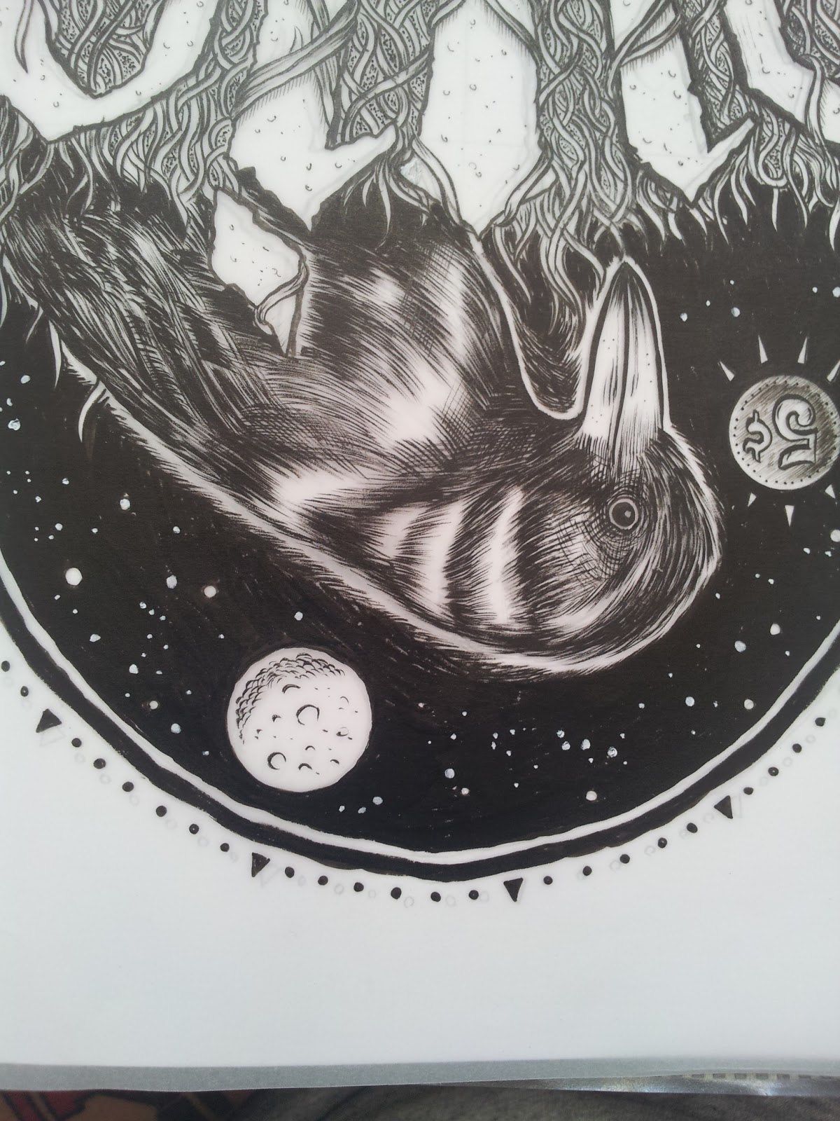
Disegnare teschi è banale. Lo fanno tutti e l'ho sempre fatto anche io.
Però questa volta mi è stato richiesto, non è stata colpa mia!
La richiesta era "realizzare una mini-serie di due illustrazioni ironiche sulla morte".
Questo è il risultato.


ENG.

Drawing skulls is trivial. Everyone do them, and I also have always drawn.
But this time it was asked me, it wasn't my fault!
The request was "make a mini-series of two ironic illustrations about death" and this is the result.


Three months of apparent death feat. a tribute poster to Motorhead!

3 mesi di apparente stop.  Non è stato pubblicato nulla non perchè abbiamo smesso di disegnare/stampare ma perchè in questi mesi abbiamo lavorato moltissimo ed è capitato che sono diventato padre ( non a caso di due gemelli! Toh! Che sorpresa!).
Sia io che Ale abbiamo lavorato molto sia su Thunderbeard sia su altro ma per ragioni di privacy e per serietà tutti i lavori che abbiamo svolto in questi mesi, non essendo ancora stati pubblicati, non li abbiamo inseriti. D'altronde ad agosto è da stupidi pubblicare qualcosa; la gente in vacanza guarda meno il computer e i relativi social networks inoltre ha soldi da spendere solo in ombrelloni e cocktails, no? Tanto vale aspettare settembre!

Il lavoro che stiamo per pubblicare è in cantiere da parecchio tempo. Kappa, titolare-fondatore di Ammonia Records non mi ha messo alcuna fretta per questo tipo di lavoro, specie per i poster.
Si tratta di una compilation tributo ai Motorhead nella quale sono presenti diversi artisti noti nel panorama alternativo italiano. L'idea è stata sua: aveva provato per i fatti suoi a mettere su un Lemmy conciato come la Marilyn di Warhol però, giustamente, non essendo il suo lavoro ha preferito delegare a me il compito di realizzarlo. Questa grafica non è affatto frutto di un lavoro troppo impegnativo, sembra evidente, ma il relativo poster è stato per noi (soprattutto per Ale) un vero e proprio traguardo.
Il primo poster a 4 colori con dimensioni sufficienti per essere considerato tale!
Inutile dire che siamo tutti quanti molto soddisfatti di quanto realizzato.

Ecco la copertina della compilation (scaricabile on line sul sito Ammonia Rec. e su iTunes) e il wip del poster!

ENG

Three months of apparent stop. We've not published anything not because we've stopped drawing / print, but because in these months we have worked very hard and it happened that I became a daddy ( Twins! What a surprise!). Ale and I have worked hard on Thunderbeard and other projects but for privacy and seriousness for all works we have done in recent months, we have not included because they are still unpublished. Moreover, in August it's stupid to release something, people on vacation don't use the computer and its social networks too much also have money to spend in umbrellas and cocktails only, right? Might wait until September as well!

The work we are going to post is in process for quite some time. Kappa, owner-founder of Ammonia Records, was in no hurry for this job, especially for the poster.
It is a compilation tribute to Motorhead with several well-known artists in the Italian alternative scene.
Kappa had the idea: he had tried on his own to put on a Lemmy rigged like Warhol's Marilyn, however, rightly, he has preferred to delegate to me the task of achieving it.
This graphic is not the result of a challenging job, it seems clear, but its poster was a real breakthrough for us (especially for Ale).
The first 4-color poster with sufficient size to be considered "Poster"!
Needless to say, we are all very satisfied with what realized.

Here's the cover of the compilation (downloadable online at Rec Ammonia and on iTunes) and the wip of the poster!


luglio 02, 2013

OWLOCTOPUS - Tattoo illustration

Mi è stato chiesto di lavorare su un tatuaggio, possibilmente traditional.
Referenze abbastanza classiche: gufi, diamanti, nuvolette e tanti, tanti colori (abbastanza atipico nel tatuaggio traditional). La prima bozza che ho fatto non era neanche un gufo. Peccato, mi piaceva molto e penso che riutilizzerò il disegno per altro (chi lo vuole faccia un fischio!!).
La seconda bozza è più vicina all'idea generale del tatuaggio, gli ingredienti principali sono presenti e somiglia più alla classica illustrazione traditional ma ad non credo di essere proprio la persona adatta per questo genere di illustrazioni perchè non li sento particolarmente; li trovo spartani e spesso c'è poco spazio per i dettagli. In questo caso ci ho messo del mio ed è per questo motivo che può sembrare malato ma in realtà, devo essere sincero, non mi sono inventato un cazzo. Teschi, gufi e piovre negli ultimi anni se ne vedono a palate! Unirli è stato divertente e il risultato mi è piaciuto.
Appena questo disegno avrà una pelle aggiornerò con un paio di foto del tatuaggio.


ENG
I was asked to work on a traditional tattoo.
Quite classic references: owls, diamonds, clouds and many, many colors (quite atypical in the traditional tattoo). The first draft I did was not an owl.  Too bad, I really liked the design and I think that reuse it for other things (who wants it let me know).
The second draft is closer to the original idea of the tatto: the main ingredients are there and looks more like a traditional illustration.
I'm not really the right person for this kind of illustration, it's a genre that I don't feel particularly because I find them too simple and there is not much space for details often. In this case I reinterpreted the subjects.
To be honest, I didn't create nothing new.

In recent years skulls, owls and octopuses are seen very often! 
Merge them was fun and I really liked the result. As soon as this drawing will have a skin, I'll update with a few pictures of the tattoo.


giugno 25, 2013

IL BUIO - t-shirt Design

Ascolto pochi gruppi italiani. Non perchè non mi piaccia il cantato in italiano, anzi, lo adoro e tra l'altro suono nei La Crisi e quindi ho a che fare con i testi di mio fratello RIGOROSAMENTE in madrelingua. Anzi, non ascolto musica di gruppi italiani proprio perchè prevale per la maggioranza l'utilizzo della lingua inglese. I motivi sono tanti e li sanno tutti quindi non c'è bisogno di parlare.
La band in questione però proviene da Thiene nel Veneto. Li conosco da qualche anno e non mi hanno mai smesso di stupire. Persone squisite, musicisti di altissimo livello con un gusto che in pochi hanno.
Dopo un EP, un 7" e un LP pubblicato di recente hanno preso un bello spazio sul mio Ipod e scalato velocemente la classifica degli ascolti. Ho sentito dire "anacronistici", "presuntuosi" o semplicemente "c'è di meglio".. tutta invidia, secondo me. Sono indubbiamente una delle migliori band attualmente in circolazione nello Stivale, provare per credere.
Dopo questa introduzione vi presento il nuovo lavoro che ho preparato per loro.
Mi hanno dato carta bianca (a volte è una cosa che mette in difficoltà ma non in casi come questo) e mi sono lasciato ispirare dal loro ultimo lavoro, "L'oceano quieto" e questo è quello che è venuto fuori.
Era da un pò che volevo provare a disegnare un ambigramma. Mi era stato proposto qualche settimana fa per un altro lavoro, un logo, per una band rap ma è uno studio di lettering poco adatto ad un logo. Il rischio è che non si capisca subito che cosa ci sia scritto, ma per un disegno, per una band come Il Buio è una soluzione che può funzionare.

Come al solito il disegno è fatto a mano mentre la colorazione nelle varie proposte è digitale.
Approfittando del fatto che il gruppo quest'estate ha diverse date da fare ho pensato fosse interessante promuovere il disegno con un poster dedicato a tutto il "tour" estivo.
Ho finito. Ora guartate!
YO!

ENG
I listen to a few italian bands Not because I don't like the singing in Italian, in fact, I love it, I play in La Crisi, and then I have to deal with the words written by my brother STRICTLY in Italian. 
I don't listen to italian bands, just because for the most prevails the use of the english language. The reasons are many and we know them all, so there is no need to talk about it..
The band in question, however, comes from Thiene. I've known them for a few years and they've never stopped to amaze me. Lovely people, high level musicians with a taste that few people have.
After an EP, a 7 " and a recent LP, took a nice space on my Ipod and quickly climbed the rankings of the plays. I heard "they are anachronistic", "arrogant" or simply" could be better " ...  just jealous, I think. With no doubt they are one of the best bands currently on the road in Italy: try and believe.
After this introduction, I present to you the new work I made for them.
They gave me carte blanche (sometimes it makes it difficult but not in this case) and I let myself be inspired by their latest work, "L'Oceano Quieto" and this is what came out.

For a while I wanted to try to draw an ambigram. I was asked a few weeks ago for another job, a logo for a rap band, but this is a kind of lettering unsuitable for a logo. You may not understand what is written, but for a drawing, for a band like Il Buio, this is a solution that can win.
As usual, the design is done by hand. The coloring in the various proposals is digital.
Considering that the group has several dates to do this summer, I thought it was interesting to promote the design with a poster dedicated to all the "Summer tour".
I'm finished. Now look!

YO!

IL BUIO


giugno 21, 2013

Boba Fett is back on the Planet!

Quello che andrò a pubblicare è un lavoro che mi è stato commissionato da una cliente ma soprattutto amica e fan delle mie creazioni (ma si può??). Una copia la terrà per se e l'altra la donerà.
E' rimasta molto colpita da le copertine dei fumetti Thunderbeard e così tenendo presente che anche lei è appassionata di fantascienza (in particolar modo di Guerre Stellari) ho deciso di inserire Boba Fett (il celebre clone cacciatore di taglie della saga di Lucas) e utilizzarlo come personaggio principale per queste due illustrazioni.
Sfruttando il concetto di "caccia" ho trasformato il clone mascherato in cacciatore di animali, un vero e proprio bracconiere di una dimensione parallela, su un pianeta dove le scimmie governano (cit. Planet of the Apes) e popolano la maggior parte del territorio e dove tutte le specie animali sono in serio pericolo di estinzione (quest'ultima cosa non è che sia poi tanto lontana dalla nostra reale dimensione!).

Non c'è una storia a dir la verità e non ci sono più personaggi di quelli che ho disegnato quindi non ho in programma nessun fumetto da disegnare (anche se è una cosa che prima o poi prenderò seriamente in considerazione).

E' importante sapere che mi è stato chiesto esplicitamente di disegnare e colorare a mano entrambe le illustrazioni e mi sono servito di pennarelli Pantone/Touch/Copic per i colori, brushpens e rapidi per l'inchiostratura e ho utilizzato una carta grezzissima dal color panna, bianco sporco per dare un effetto vintage naturale. Le dimensioni sono leggermente più grandi di un A4.
In conclusione, sono soddisfatto, ma si può sempre migliorare!

Ecco le immagini.
YO!


ENG
What I'm going to publish is a work that has been commissioned by a client, but especially a friend and fan of my creations (so weird!). A copy for herself, the other one will be donated to her friend.
She was very impressed by the covers of Thunderbeard's Comics so, considering that she's a lover of science fiction (especially Star Wars), I decided to include Boba Fett (the famous clone and bounty hunter of Lucas' saga) and use it as the main character for these two illustrations.
Using the theme of "hunting" I turned the masked clone in hunter of animals, a real poacher in a parallel dimension, on a planet where the apes rule (cited in Planet of the Apes) and populate the most part of the territory and where all animal species are in serious danger of extinction (this is not so far away from our real dimension!).

To be honest, there is no story and there are no more of those characters I drew so I have no plans to draw comics (sooner or later will seriously consider this thing).


It is important to know that I explicitly asked to draw and color by hand both illustrations. 

I used Pantone / Touch / Copic markers  for colors, brushpens and rapidograph for inking.
I chose a very rough cream-colored paper to give it a vintage/natural look. 
The dimensions are slightly bigger than an A4.
In conclusion, I am satisfied, but I can always do better!

YO!


giugno 12, 2013

VIDEO: The making of "Zoe's & The Four Elements"

Questo filmato è solo un assaggio delle magliette che l'8 giugno sono state presentate e vendute al pubblico presso Zoe's a Manerbio (Brescia).

Grazie a Riccardo per aver voluto filmare e documentare parte dei processi di lavorazione e a Vale che mi (ci) ha dato la possibilità di disegnare (stampare) per lei e il suo meraviglioso progetto.

ENG
This movie is just a taste of the shirts that on June 8, were presented and sold to the people at Zoe's Manerbio (Brescia).

Thanks to Riccardo for filming parts of the working process and many thanks to Vale who gave me (us) the opportunity to design (print) for her and her wonderful project.

Making of Zoe's and the four elements from Ricky on Vimeo.

That's a Tough Rooster! - "It's Tough Enough"

Hey!
Il mio amico Frank di Urbank Shop mi ha commissionato un lavoro super-veloce. Una manciata di giorni per tirare fuori un gallo dal cilindro! Il risultato è questo... godetevelo!

Hey!
My friend Frank (Urbank Shop) asked me to drawing a super-fast. 
A handful of days to pull off a rooster from the hat! The result is this ... enjoy!